Responsive background image cover with the <img> tag
Examples
Image without responsive behaviour
.object-fit-container-example-1 {
    width: 100%;
    height: 300px;
}
<div class="object-fit-container cover object-fit-container-example-1">
    <img src="example-images/example1@1200x600.jpg" alt="Example image" />
</div>
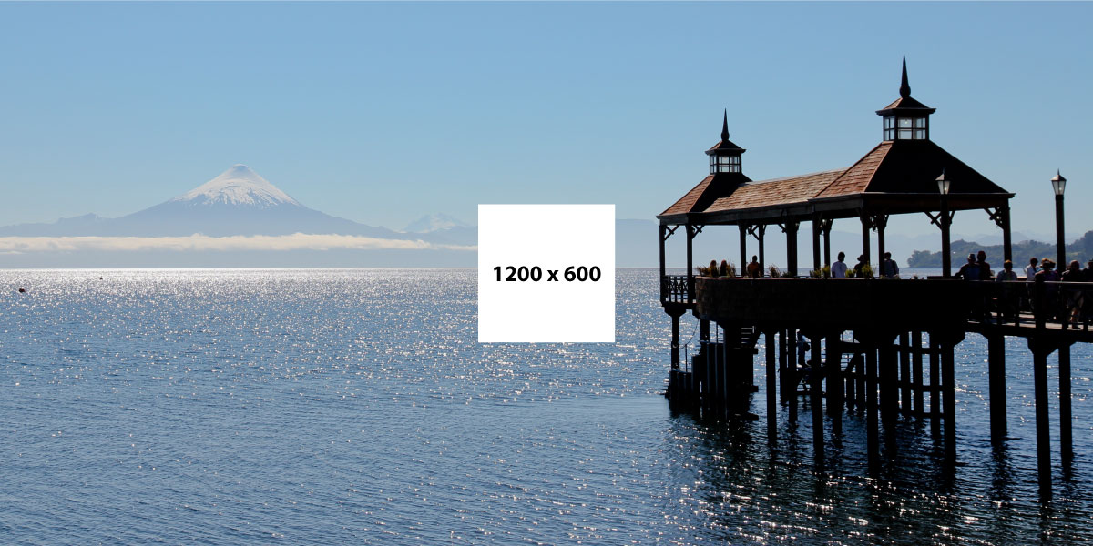
Image with responsive behaviour (srcset attribute)
Want to know more about using srcset or the picture element? Read about it on Jake Archibalds blog
.object-fit-container-example-2 {
    width: 100%;
    height: 300px;
}
<div class="object-fit-container cover object-fit-container-example-2">
    <img src="example-images/example2@400x267.jpg"
         srcset="example-images/example2@2400x1600.jpg 2400w,
                 example-images/example2@1200x800.jpg 1200w,
                 example-images/example2@800x533.jpg 800w,
                 example-images/example2@400x267.jpg 400w"
         sizes="(min-width: 1200px) 1170px,
                (min-width: 992px) 970px,
                (min-width: 768px) 750px,
                100vw"
         alt="Example 2" />
</div>
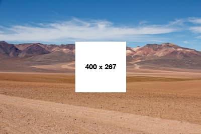
Note: You only will see a changing src image when starting with a small viewport width. The browsers only downloads larger images when having cached versions of the same image.
Image with responsive behaviour (picture-tag)
Want to know more about using srcset or the picture element? Read about it on Jake Archibald's blog
.object-fit-container-example-3 {
    width: 100%;
    height: 300px;
}

@media (max-width: 991px) {
    .object-fit-container-example-3 {
        height: 600px;
    }
}
<div class="object-fit-container cover object-fit-container-example-3">
    <picture>
        <!--[if IE 9]><video style="display: none;"><![endif]-->

        // the portrait picture
        <source media="(max-width: 991px)"
            srcset="example-images/example3-portrait@800x1200.jpg 800w,
                    example-images/example3-portrait@400x600.jpg 400w"
            sizes="(min-width: 768px) 720px, 100vw">
        <!--[if IE 9]></video><![endif]-->

        // the landscape picture
        <img srcset="example-images/example3-landscape@2400x1350.jpg 2400w,
                     example-images/example3-landscape@1200x675.jpg 1200w"
            sizes="(min-width: 1200px) 1140px, (min-width: 992px) 940px"
            alt="Example 3" />
    </picture>
</div>
Note: More about the IE9 fix on the Picturefill website.

Note: You only will see a changing src image when starting with a small viewport width. When the browsers already has downloaded a larger image, then the smaller isn't downloaded anymore.